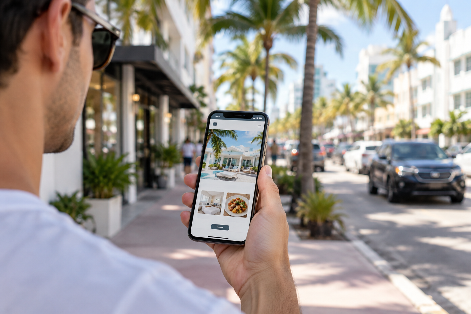
Picture a potential customer standing outside a restaurant in Brickell, searching for a plumber from the back of a rideshare, or looking for a dentist while waiting at a light on US-1. They are all doing the same thing: searching on a phone. If your site is slow, cramped, or broken on a small screen, they leave in seconds and call the next business on the list.
The good news is that checking your site takes about five minutes, and most fixes are simple. Here's how to run a mobile-friendly website test and what to do with the results.
The 5-Minute Mobile-Friendly Website Test
Step 1: Use your own phone, like a customer would
Skip the desktop preview. Grab your phone, open your browser, and type in your web address. Then ask yourself:
- Does the page load in a few seconds, or do you find yourself waiting?
- Can you read the text without pinching or zooming?
- Can you tap buttons and menu items without hitting the wrong one?
- Is your phone number tap-to-call?
- Do you have to scroll sideways to see everything?
Step 2: Try to complete the main goal
Whatever you want visitors to do, whether that's booking, requesting a quote, or calling, do it yourself on mobile. If a form is awkward to fill out or a button is hidden below a giant banner, you've found a real revenue leak.
Step 3: Run a free speed and usability check
Paste your URL into Google's PageSpeed Insights and look at the Mobile tab. It flags slow elements, oversized images, and layout issues in plain language. Google Search Console also reports mobile usability problems if you have it set up.
Step 4: Test on a real-world connection
Turn off Wi-Fi and load your site on cellular data. Your office network may be fast, but customers are often on a spotty signal in a parking garage or on the road. If your site only works well on strong Wi-Fi, it's too heavy.
Step 5: Check a second device
Ask a friend with a different phone, ideally an older Android or iPhone, to open your site. Sites can look perfect on one device and break on another.
Why Your Website Might Not Be Loading on Phones
If your website is not loading on a phone, or loads painfully slowly, one of these is usually the culprit:
- Huge images. A photo uploaded straight from a camera can be many times larger than it needs to be.
- Too many plugins or scripts. Chat widgets, sliders, pop-ups, and tracking tools all add weight.
- Slow or overcrowded hosting. Cheap shared hosting can bottleneck even a well-built site.
- A non-responsive design. Older sites built for desktop only simply shrink down instead of adapting.
- Auto-playing video or heavy animations. Fun on a big monitor, painful on a phone.
Simple Fixes You Can Make This Week
Compress and resize your images
This is usually the biggest quick win. Resize images to the dimensions they're actually displayed at and compress them before uploading. Modern formats like WebP can cut file size significantly.
Make buttons and text thumb-friendly
Body text should be comfortable to read without zooming. Buttons and links need enough space around them that a thumb can tap them accurately. Put your most important button, usually "Call" or "Get a Quote," near the top.
Simplify your menu
A long navigation bar becomes a mess on mobile. Use a clean menu with only the pages people actually need: services, about, reviews, contact.
Remove what you don't need
Audit your plugins and third-party scripts. If you can't say what a tool is doing for your business, it's a candidate for removal. Intrusive pop-ups that cover the screen are especially frustrating on phones.
Add tap-to-call and easy directions
For local businesses in Miami, this matters a lot. A tap-to-call phone number and a map link make it easy for someone nearby to reach you in one touch.
Check your hosting
If your pages are slow even after optimizing images and plugins, your hosting may be the bottleneck. Moving to quality hosting can make a noticeable difference.
When a Redesign Makes More Sense
Patching works for many sites, but not all. Consider a rebuild if your site:
- Was built many years ago and was never designed to be responsive
- Requires pinching and zooming on every page
- Breaks whenever you try to update it
- Still scores poorly on mobile after the basic fixes above
A proper mobile website design starts with the phone experience first, then scales up to desktop. That approach tends to produce faster, simpler pages that are easier for both customers and search engines to use.
Make Mobile Part of Your Routine
Run this test every few months and after any major change to your site. New plugins, new photos, or a new theme can quietly slow things down. Spending five minutes now can save you from losing customers you never knew you had.
Need a Hand?
If your site fails the test or you're not sure how to fix what you found, Megapixall designs fast, mobile-friendly websites for Miami-area small businesses. Contact us and we'll take a look at your site and tell you honestly what needs to change.